Tuesday, May 8, 2012

Beyond the Theory: Seurat

While looking into color theory one of the famous artists I found was George Seurat. He is pretty much the man who started the neo-impressionistic movement.

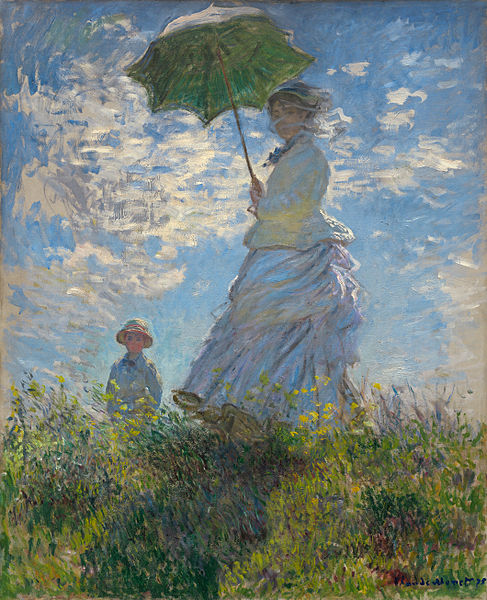
Neo-impressionism is like impressionism in its way that the paint/drawing is applied in short strokes, more specifically in dots. One of the main forms on neo-impressionism is pointillism. This is where the drawing is made up of solid colored dots that when together are seen as one complete painting.
Example:


Photo of Sunday Afternoon on the Island of La Grande Jatte by Seurat

Can you see the colored dots? All the dots are individual colors to make up a bigger picture. Also it took Seurat 2 years to complete this 10 foot painting.

At the time, in the mid to late 1800s, scientists were finding out more about what would become color theory and what colors were and how they interacted. Once the artists got a hold of the new discoveries they in turn tried new ways of using color in their paintings. This is a continuation of what impressionism started to do, but there's enough difference that the 'true' impressionists didn't want to accept this new style as impressionism. So the group of modern artists was in divide but their art was still produced and shown at galleries no matter the quarrels between the artists themselves.

Neo-impressionism grew into a whole new realm of painting with many different variations from artists like Charles Angrand, Anna Boch, Georges Lemmen, and Paul Signac are a few. More than just the actual style of painting the movement changed the subjects as well to include more political and social ideas.


Breaking Tradition: The Impressionism Movement

Notable art used to only consist of  smooth realistic paintings of history or religious themes or portraits. There was little in the way of individual creativity. In the early 1800s there was Salon de Paris, where artists won awards of recognition for great art. As is with everything it seems in life the old reliable artists who painted according to the accepted styles always had more favor.  This did not bode well for the younger artists.

They were painting in lighter ways and the subjects more realistic (or not) common day things. After  so many works were being rejected by elite judges from the Salon de Paris Emperor Napaleon III created the Salon des Refuses (Salon of the Refused) where the public could judge. Before this though a group of young talented artists had been painting together. This group consisted of Claude Monet, Pierre-Auguste Renoir, Alfred Sisley, and Frederic Bazille. Together these artists were creating a new painting style, most of which was why their work wasn't accepted at the Salon. Later on Monet, Renoir, Pissarro, and Sisley started the Coiete Anonyme Cooperative des Artistes,Peinteres, Sculpteurs, Graveurs (Cooperative and Anonymous Association of Painters, Sculptors, and Engravers). They and other artists (Edouard Manet, Camille Pissarro, Paul Cezanne, Armand Guillaumin, and more) were starting a new movement.

This style was much more contemporary and the first of modern art. Focusing on movement, the use of light, common things such as people, landscapes, and still life, and the use of small yet visible brush strokes to create a realistic painting that was unique to each artist. This was impressionism.

This is just the beginning of impressionism that has so much more to it's story.
For now, though, here is my favorite impressionism painting.

File:Claude Monet 011.jpg

Woman with a Parasol by Monet


Monday, May 7, 2012

Color Theory 3: Harmony and Our World

Colors have such a deep connection to our history and culture that even beyond the physical reactions from our eyes to the different colors and color harmonies there is such a deeper meaning to what we see. The symbolism of colors and the harmonies make color theory an even more complicated subject. The basics, though, can be accounted for through how our eyes perceive and interpret colors.

The way we view color, or more specifically how we react to color is mostly based on our  the science behind what color actual is, how our eyes see it, and how our brains process the color.
While I won't go into the in-depth process of how our eyes receive different colors, some science facts helpful and interesting.

The human eye can see 7,000,000 colors. Based how our eyes are stimulated by the color that is how our brain interprets the color. This is why certain colors seem too bright or annoying, our eyes are being over stimulated. This is also why in nature we get signals of what's dangerous and what is safe, because of colors.

Also because of what we see throughout nature and what we use colors in our lives affects the reaction we would have when we see that color. Like when we see blue it connects with water; water can be connected to blue gloomy days or the peace and openness of the sea or sky. Plus your cultural background will affect how the meaning comes about.

With all the colors and the harmonies there are many different physical, natural, and cultural reactions

Examples:

Warmer colors such as red, orange, and yellow appear warmer (just as they are called). More associated with happy, energetic, passion, intensity, wealth, and change. This is why, for example, that red can seen as sexy passion but also warning for dangers and stop signs.
Photo by me

Cooler colors such as blue, green, and purple give the appearance of calm and stability compared to the warmer colors, more reserved in nature also. This is why green is more associated with nature (go-green things) or why purple is connected with royalty.
Photo by me


Saturday, May 5, 2012

Color Theory 2

The relationships between the colors on the color wheel are what really brings out the understanding of why some things will look good to our eyes and some are just irritating. The good relationships between different colors are immediately noticeable even if it's subconsciously. The basic relationships are usually called color harmonies.

Here are some example of color harmonies:

Complementary: These are colors across from each other on the color wheel. For example red and green or blue and yellow. These colors are very contrasting. They stand out quite a bit and accent each other well. (For added effect adding shades of the complementary colors intensifies the depth)

complementary
Color wheel courtesy of http://www.tigercolor.com/color-lab/color-theory/color-theory-intro.htm

Analogous: These colors are the three shades that are next to each other on the color wheel. These are similar colors and appear comfortable to our eyes.

analogous
Color wheel courtesy of http://www.tigercolor.com/color-lab/color-theory/color-theory-intro.htm

Triadic: These colors are evenly spaced on the color wheel. The three colors would form a triangle on the color wheel. On a twelve color wheel (most basic common one) then it's every 4th color.

triad
Color wheel courtesy of http://www.tigercolor.com/color-lab/color-theory/color-theory-intro.htm

The harmonies can help accent a certain point in an art piece or give theme to the whole piece. Different harmonies create a different atmosphere for the art and will create different reactions from the viewer. I'll explain more about color and its relationship to us in color theory 3.

P.S.

While researching about color theory I came across a really cool color wheel machine coordinator. You can set different themes such as complementary, analogous, etc...and set to whatever colors you want. It's very easy and fun too use.
Try it out!
http://colorschemedesigner.com/

Tuesday, May 1, 2012

Color Theory 1

Color is way more dynamic than people realize. Color can add life to a painting and invoke such a response that you don't even realize all the ways that the color is influencing your perception of the world around you. Color theory is like the study of  color itself, looking into the properties of color like the color wheel and the context of how color is communicated.

Let's start off with the color wheel and what it entails.

The color wheel is based off firstly the primary colors, these are the colors that cannot be made by the other colors.
Red   Blue  Yellow
From these colors you can actually make all the other colors except white. While technically white is a mixture of all the colors scientifically, artistically it just comes out as a mess of blackish stuff if you mix all your paint together.

From the primary colors the secondary colors are born.
Green  Orange  Purple


From the primary and secondary colors come the tertiary colors.
Yellow-orange  Red-orange  Red-purple  Blue-purple  Blue-green   Yellow-green


Then from these the colors keep expanding with different hues (shades of darkness and lightness). Though with the primary, secondary, tertiary this one of the basic colors wheels.


Color Wheel from http://webdesignsolutions.com/n-4205-color-theory-in-web-design-does-it-matter.html

Going more in-depth into color wheels could take books and quite a bit of controversy would be involved as well. While the basic colors and wheel is not argued, how the wheel is arranged and what is exactly called what has always been debated. There are many different types of wheels that accommodate all the differing opinions. From expanded hues to different shapes and color relationships there are plenty of different wheels to find any color. Though even now artists and scientist do research the possibilities of colors and how the colors communicate with each other.

I'll continue more into color theory and the actual relationships between colors themselves and the relationships between us and colors in Color Theory 2.

Tuesday, April 24, 2012

Da Vinci's Perspective

Leonardo da Vinci's look into perspective

One of the most famous artists for his keen eye for perspective in his art is Leonardo da Vinci. Being able to to basically create a perfect view. From a young age, his earliest works coming about when he apprenticed under Verrocchio, he created amazing pieces of art.  Leonardo was very intelligent man, a renaissance man with many talents from art to sculpture to science.

His earliest works (at least by the consensus) 


 The Baptism of Christ
The Baptism of Christ - Leonardo da Vinci 
  file from: http://www.wikipaintings.org/en/leonardo-da-vinci/the-baptism-of-christ 


Annunciation    
 file from: http://www.leonardo-da-vinci-biography.com/annunciation-leonardo-da-vinci.html


due to copyright laws his artwork is now public domain since the allotted time for copyright has passed

His understanding  of the world around him helped him have a better grasp of  placement and key relations between the points in his art is a part of what makes his artwork phenomenal. Beyond the astounding perspective views using his finding and understandings of science helped him create more realistic and modern art. People are still amazed at his precision just as they were back in the late 1400s.

Here are a couple sites for more information about Leonardo:
http://www.biography.com/people/leonardo-da-vinci-40396
         The biography channel did an interesting video of Leonardo da Vinci that you can watch here. It goes on about the The Da Vinci Code by Dan Brown that was published but does have good information beside that.
http://www.museoscienza.org/leonardo/
         This site is in Italian but if your browser can translate or you speak Italian this is an interesting site about the Leonardo museum and more information.


Thursday, March 1, 2012

Art Museums

Looky Loo
Art Museums

Talking and looking at pictures of art is always helpful when learning about art, but I feel that to really get a new view and a full grasp of art you need to see it in person. You don't need to go to some fancy pants art museum either, though if possible seeing really famous artwork is always a treat. I've been to a few art museums and have enjoyed them all. Yes you need some patience to go around a building looking at walls but if you find the beauty that is there beyond the 'oh that's pretty' then you might be amazed. 

I've been to a lot of little museums that just show local art (which is good so don't be put off) so I can't name them all. I've also been to a few major and not so major museums such as the Denver Art Museum in Denver, CO, McNay Art Museum in San Antonio, TX, Wichita Art Museum in Wichita, KS. All of them I recommend to go to. The McNay was probably the most memorable for me. I went there in the summer of 2010 with my parents. The McNay is a private collection of Marion Koogler McNay, a female artist who starting collecting artwork in 1927. This collection grew to more than 700 pieces which she left after her death in 1950 to become the first art museum in Texas. Now the museum has over 20,000 pieces of artwork. Many pieces are very well know, including the original Water Lilies by Monet. This piece I never really liked or even understood why it was considered beautiful until I saw it in person. The painting was simply amazing to me. Now I want every chance to go an art museum.

Here are the locations of the three art museums.


McNay Art Museum, San Antonio, TX


Denver Art Museum, Denver, CO


View Larger Map


Wichita Art Museum, Wichita, KS


View Larger Map
View Larger Map

Shading 1: Hatching and Cross Hatching

Shading 1:
Hatching and Cross hatching

Shading is a way to add depth to a drawing. Showing the shadows and lighting gives 3-dimensional elements to the 2-dimensional paper. There are many types of shading  and one of the basic ones is hatching. Hatching can also be used as just a way that the drawing is made up. For example in the slideshow below there's Van Gogh's Starry Night.

Basic Terms
Hatching is just using lines at different lightness/darkness and different spaced intervals to show the transition from light to dark on an object.

Cross Hatching is using these same lines as in hatching but using criss-crossing  them.

Contour lines are the lines that follow along the shape of the object, this is another step to adding depth and with hatching contour lines are used to apply the shading to fit the object.


Here I'll show various hatching and cross hatching examples.

Wednesday, February 29, 2012

Perspective: One and Two Point

Perspective

One of the basics in art that many people have a hard time with is perspective. Mostly from what I know and see people over-think it.

In art, perspective is
a technique of depicting volumes and spatial relationships on a flat surface,
according to dictionary.reference.com.

Basically, put what you see on the piece of paper.

Many get all worked up about that they can't get it to look right, even I'm guilty of this, but relax. You're taking a 3 dimensional world and putting it in a 2 dimensional world, some things are going to get a little wonky. Though perspective is a giant subject so don't expect to just get it overnight either, unless you're some artistic genius. I'll come back to perspective several times in later posts but for now I'll just take a little dip into this giant pool.

I'll start with the basic one point and two point perspectives. These show how the objects will relate to each other based on lines in certain directions to the horizon.

Basic Terms
Horizon: the line across dividing the paper into 2 sections. Think of like the horizon between the sky and the ground.

Center of vision: the imaginary line where the center of your vision (view) is, the center of the drawing.

Vanishing Point: the point at which lines converge or where all the  lines go.

Eye level: the horizontal line where your vision, this is kind of like the horizon line but this doesn't have to be the horizon line


Here are some perspective drawings I've done of two different hallways:


Thursday, February 2, 2012

Introduction

Art is something very precious, at least to me. The impact they have on society and how society impacts art in return is profound. While I'm no art historian or even a professional artist, I want to find out the significance of these famous artworks and give my own try at the techniques used in them.

I give no promise that I won't rant about how beautiful the stroke of paint is on a particular painting or how stupid it is that people actually like an art piece. I'll try at objectivity, though just in case of a derailing I'll give some background where I'm coming from.

I'm from a small town in the Midwest and have a happy family with two loving parents and a younger brother. This is my first in college as a Mass Media major emphasis in advertising. I love to draw, paint, finger-paint, anything artsy that I can create. I've taken a few basic art classes but mostly I just figure it out on my own. Being quite artsy goes right in hand with being quirky, and quirky I am. The world around me fascinates me, as well as other people's views and ideologies. It's most likely why I'm so interested in history, foreign and native culture, and art in the first place.